When colour calls, You answer
Because some rooms ask you to be a little brave.
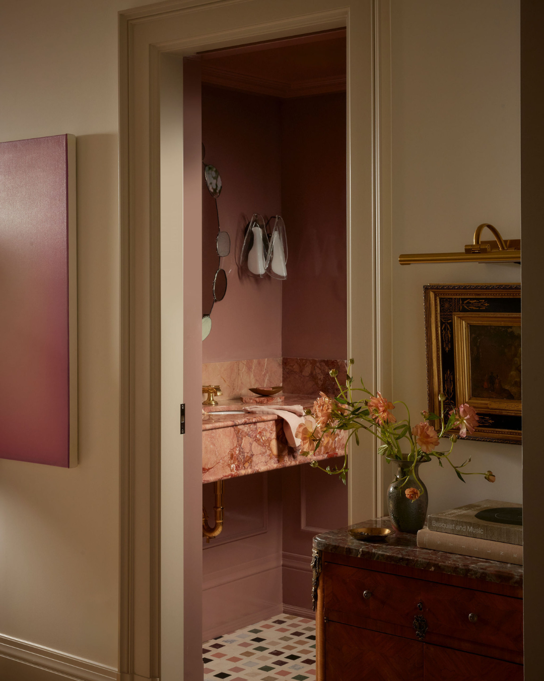
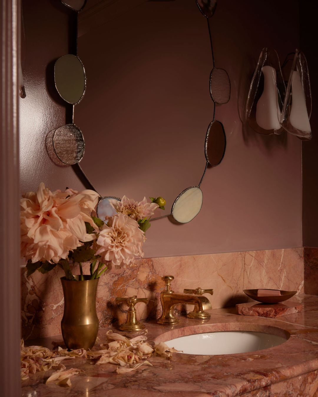
Hawthorne Powder Room
Some rooms ask you to be just a little brave.
Colour can feel like a commitment. Once you begin, there’s rarely a halfway point, because colour asks you to trust the decision and to follow it all the way through.
And when it’s right, it changes everything.
Start With A Moment
In most projects, colour doesn’t begin as a full palette.
It starts with something smaller.
A tile.
A piece of stone.
A tone that feels right in the space.
From there, the room begins to take shape.
Rather than layering colour all at once, we let it build gradually with each element responding to the one before it. This keeps the space feeling considered, not forced.
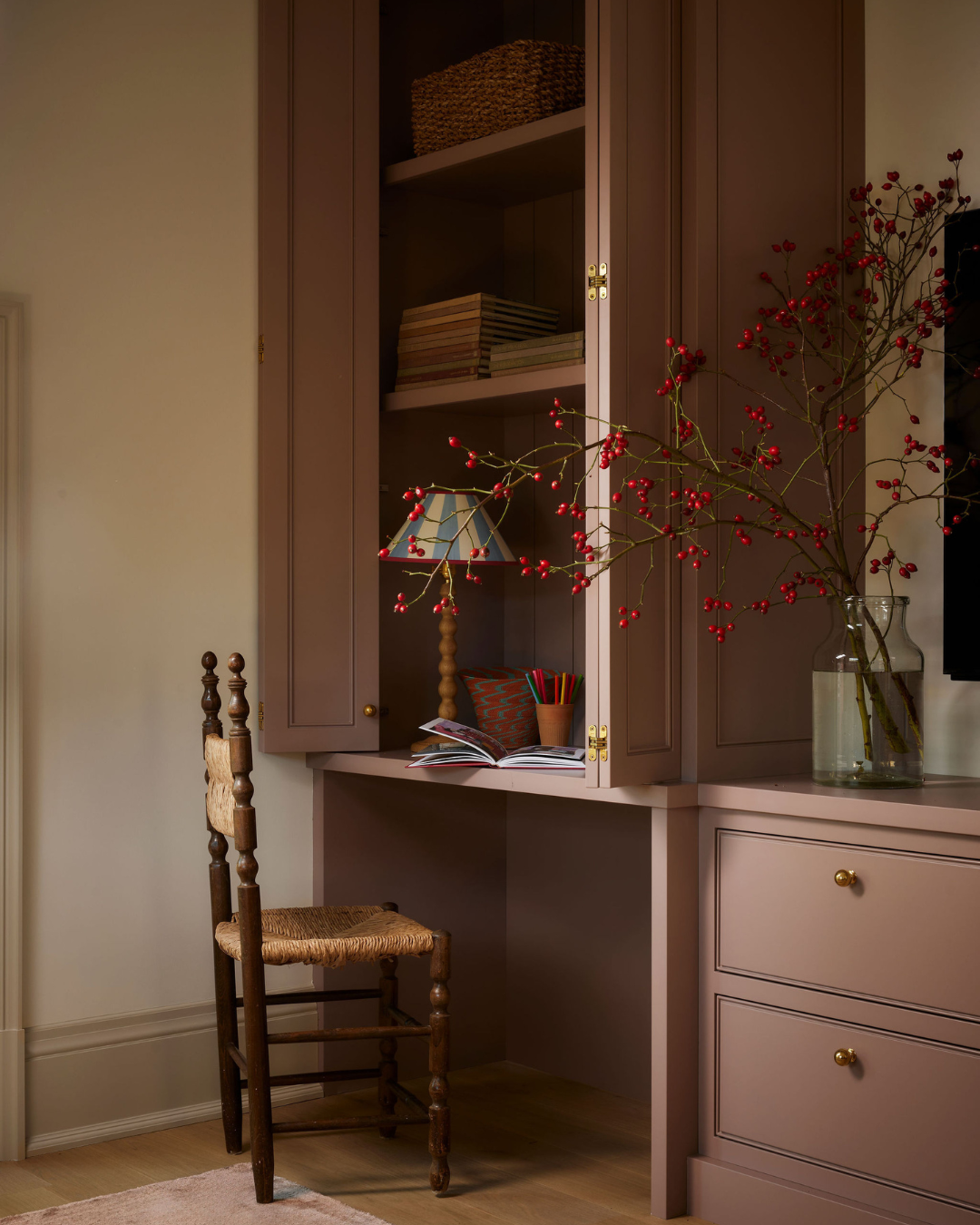
Hawthorne Home Office
Colour Drenching: Let Colour Live!
One of the most effective ways to use colour is to let it fully live in the space.
Colour drenching. where walls, millwork, and sometimes even ceilings are wrapped in the same tone, creating a sense of cohesion and calm.
It removes visual breaks and allows the eye to move easily through the room.
This works especially well in smaller spaces like powder rooms, where a more immersive approach can feel intentional rather than overwhelming.
The key is restraint within the palette.
Even when everything is one colour, variation in texture – stone, paint, tile, lighting – keeps the space layered and interesting.
Hawthorne Powder Room
Complementary, Not Competing
When introducing additional tones, it’s less about contrast and more about relationships.
We often look for colours that sit comfortably together – subtle shifts in tone, warmth, or depth – rather than sharp opposites.
A warm pink paired with aged brass.
Soft stone that carries a similar undertone.
Lighting that enhances rather than interrupts.
When colours feel connected, the space reads as calm and cohesive.
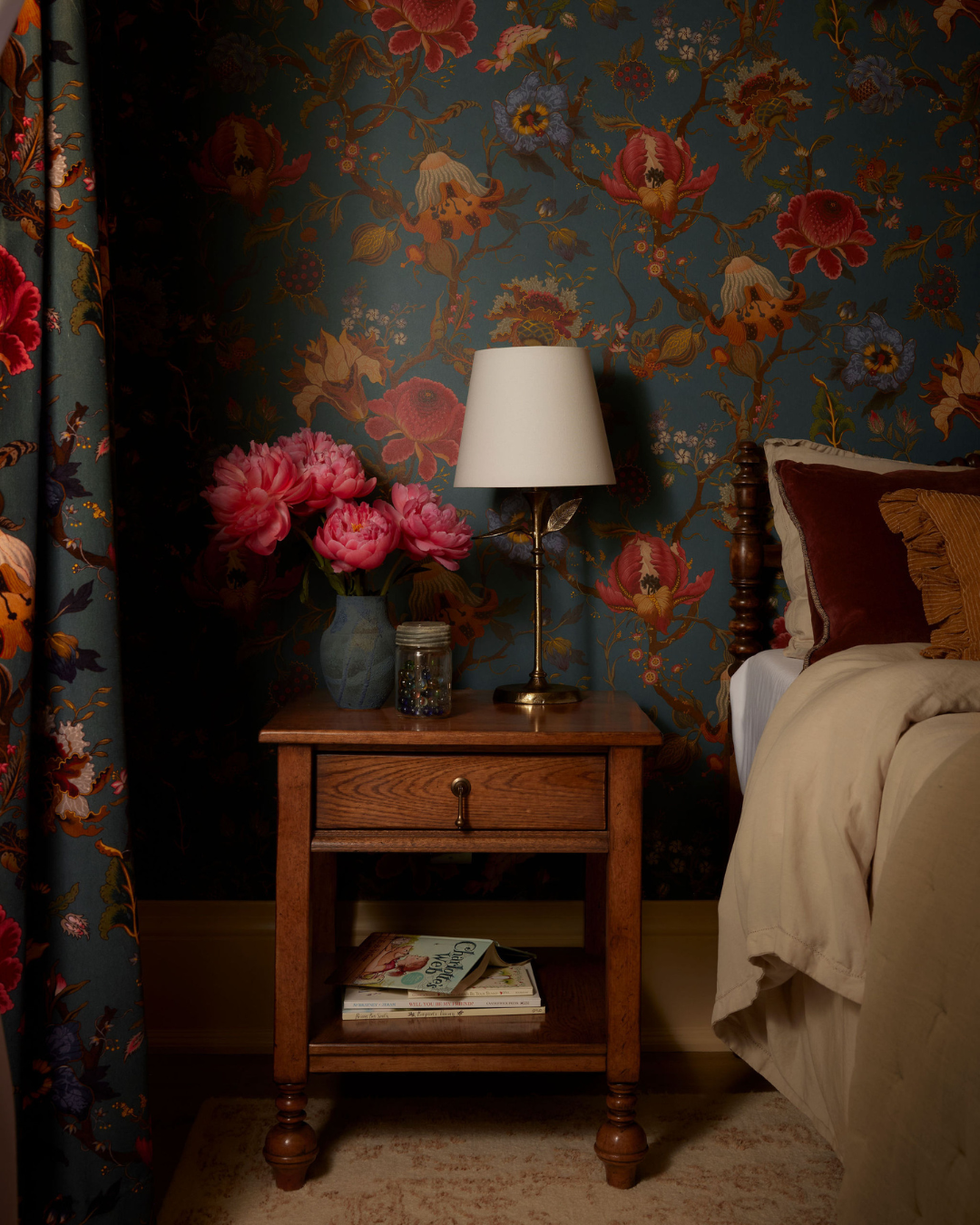
Hawthorne Bedroom
Knowing When to Pull Back (and When Not To)
There’s often a moment in the design process where a room could shift.
It could soften.
Become more neutral.
Feel safer.
And sometimes, that’s the right decision.
But other times, it’s the moment to lean in.
The most memorable spaces are often the ones where the original idea is carried all the way through – here the colour isn’t diluted, but supported.
That’s where confidence in the design really shows.
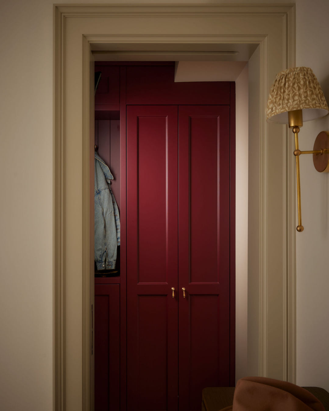
Hawthorne Entryway
Adding Colour, More Gently
Not every room needs to be fully immersed in colour.
Sometimes it’s introduced more quietly.
Through upholstery.
Through artwork.
Through smaller, layered moments.
This approach allows colour to sit alongside more neutral elements, adding warmth and personality without defining the entire space.
Both approaches are equally valid – it simply depends on what the room is asking for.
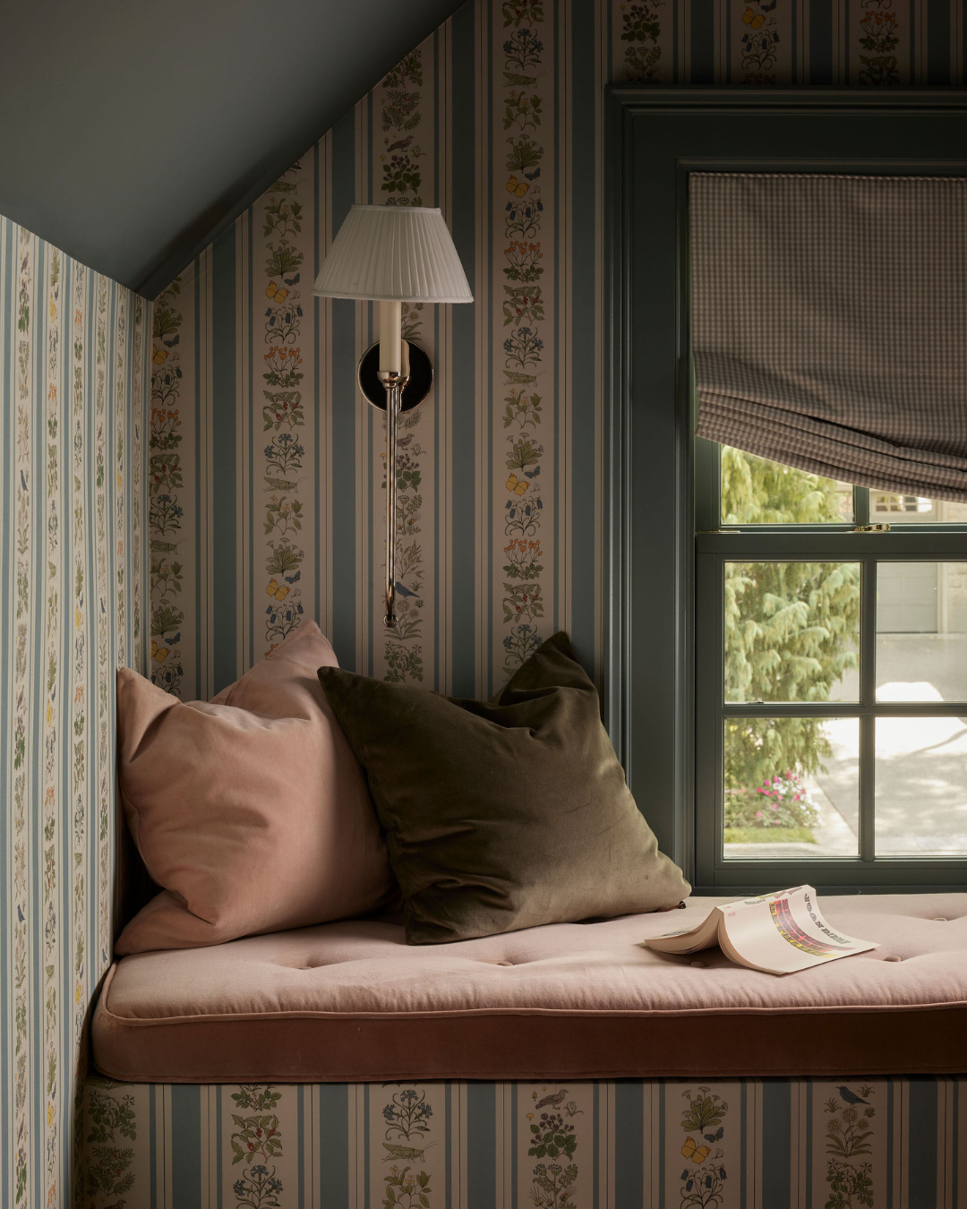
Hawthorne Third Story
When It Feels Right, You Know
Designing with colour isn’t about being bold for the sake of it.
It’s about understanding the space, and recognizing when it’s asking for something more.
Because when colour is used thoughtfully, it doesn’t feel overwhelming.
It feels intentional.
And often, those are the spaces people remember most.