
The Paint Colours Behind Parris' Home Renovation
Throughout the renovation, colour was used intentionally—not simply as a finishing touch, but as a way to shape the atmosphere of each room.
Rather than relying on a single neutral palette, every space was given its own identity based on how it would be lived in, the natural light it receives, and the feeling it was meant to evoke. The result is a home that feels layered, personal, and full of character while remaining cohesive from room to room.
Here's a look at each of the paint colours used throughout the home – and the thinking behind each choice.
Laundry Room
Farrow & Ball
Morning Sun
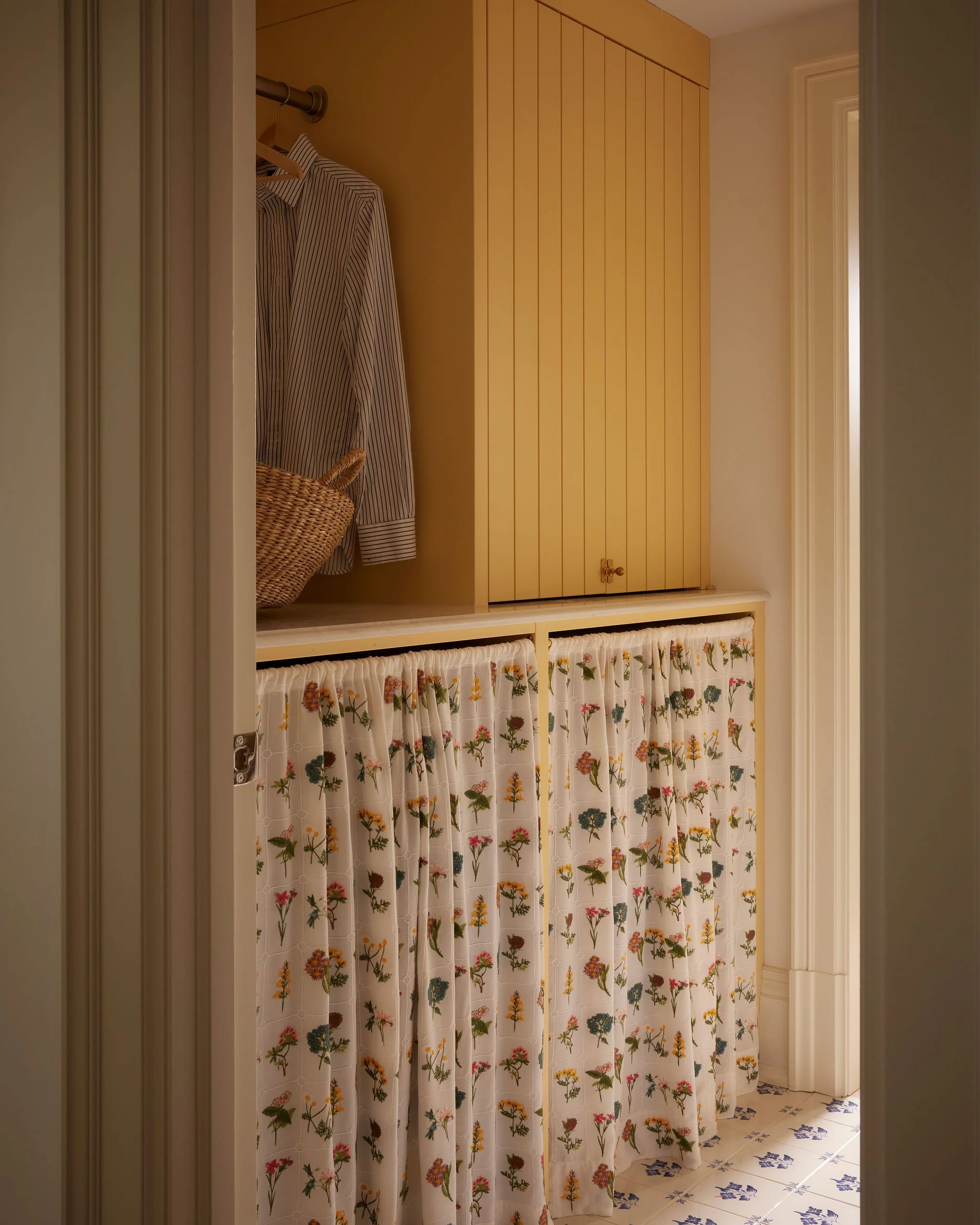
The laundry room presented an opportunity to bring a sense of joy to one of the home's most functional spaces. Morning Sun was selected for its soft, buttery warmth, instantly making the room feel bright, welcoming, and optimistic.
Paired with floral linens, the colour creates a nostalgic, almost European-inspired utility room that feels as beautiful as it is practical. It demonstrates that hardworking spaces deserve just as much attention as the rest of the home.
Front Hall
Sherwin-Williams
Sundried Tomato
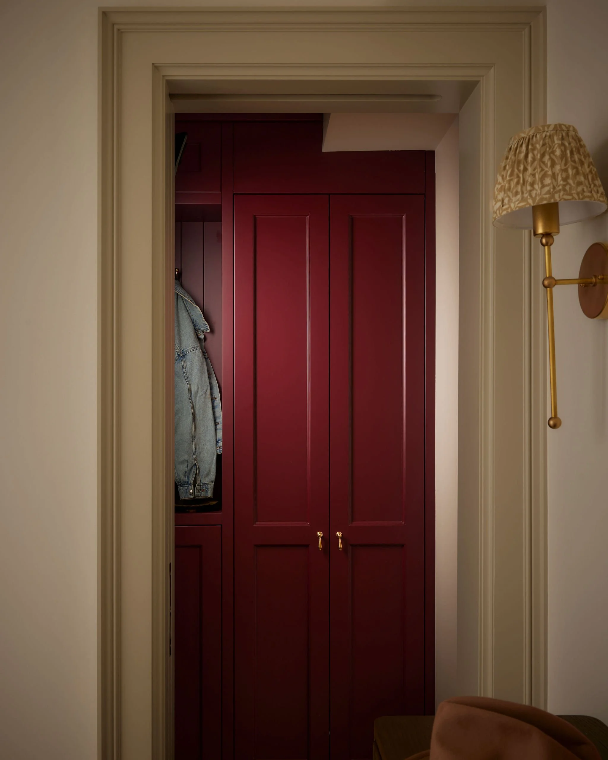
The entrance sets the tone for the entire home, so it was important that it felt both memorable and inviting.
Sundried Tomato is a rich, earthy red with warm brown undertones that creates depth without feeling overpowering. Combined with traditional millwork and brass hardware, it brings warmth and personality to the entry while establishing the layered aesthetic carried throughout the renovation.
It's a colour that welcomes guests from the moment they step inside.
Kids' Desks
Sherwin-Williams
Cocoa Berry
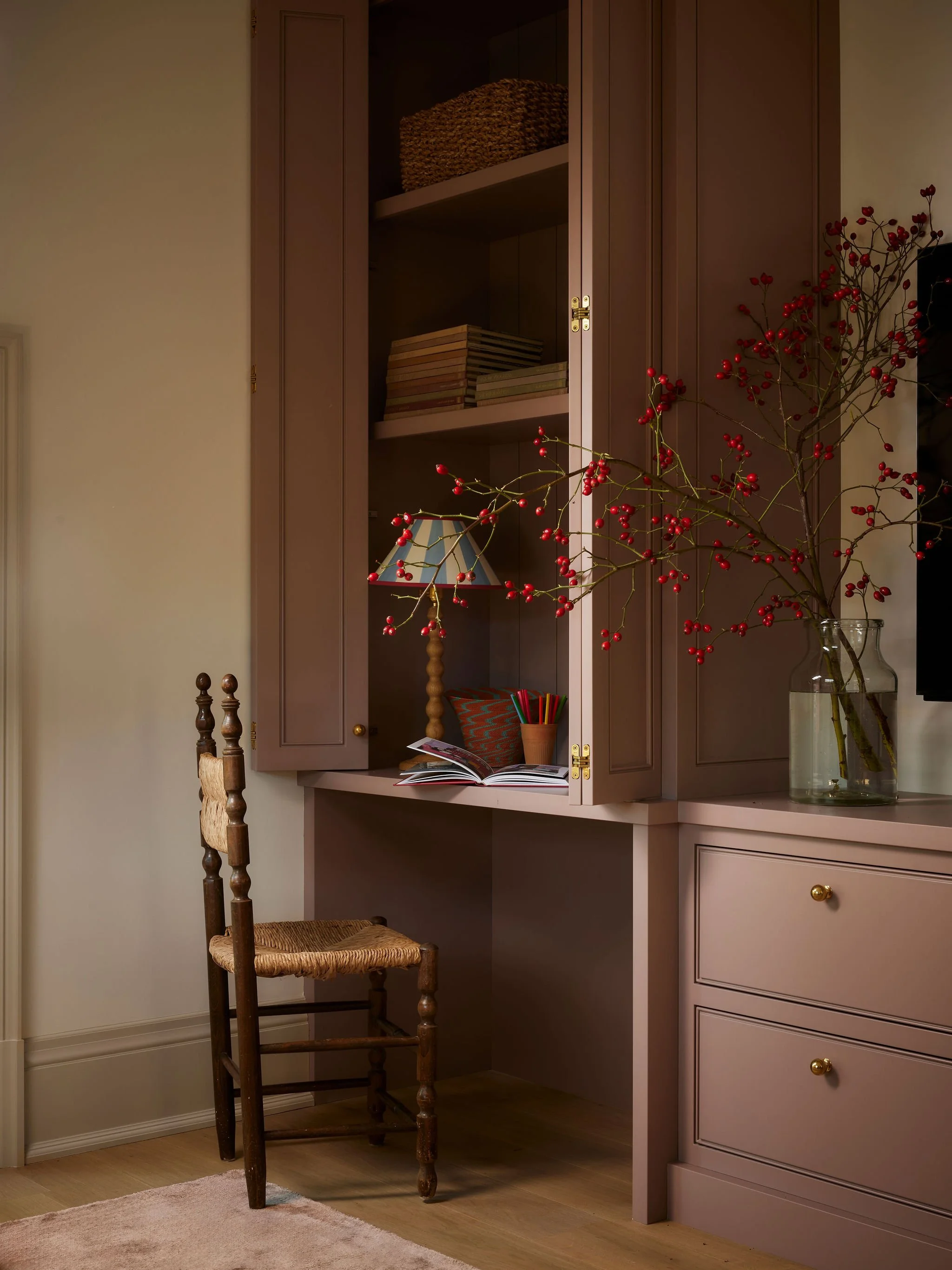
Designed to feel playful without becoming overly youthful, the built-in desks were painted in Cocoa Berry, a muted dusty pink that introduces warmth and personality.
The colour creates a calm backdrop for creativity, reading, and everyday family life while remaining sophisticated enough to evolve with the space over time. It's a reminder that softer colours can still feel timeless when thoughtfully applied.
Powder Room
Farrow & Ball
Sulking Room Pink
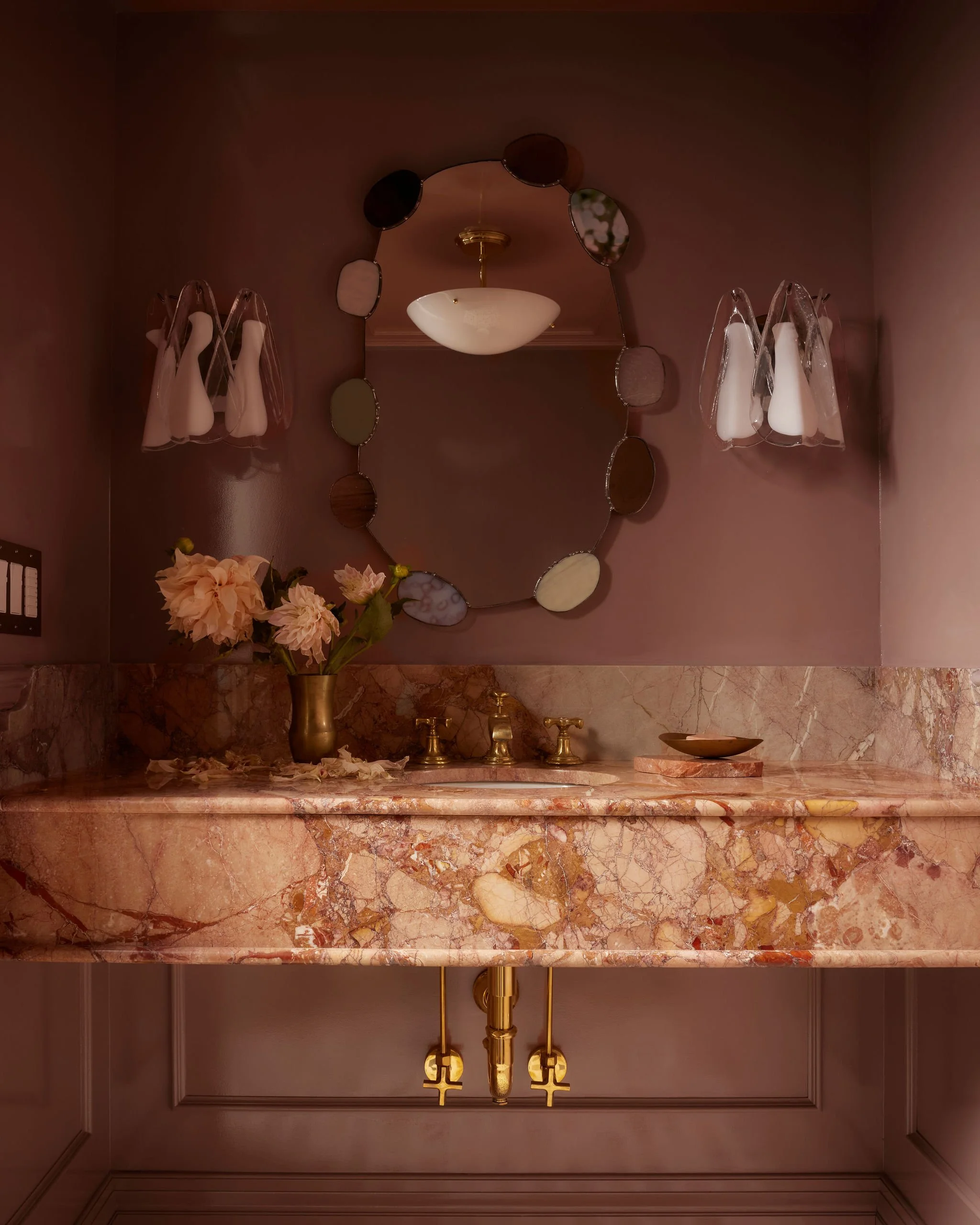
The powder room became the home's most expressive space.
Despite its name, Sulking Room Pink is far from a traditional pink. Its muted rose tones and subtle grey undertones create a colour that shifts beautifully throughout the day, appearing warm and enveloping in the evening while feeling soft and elegant in natural light.
Layered with richly veined stone, brass fixtures, and sculptural lighting, the room embraces a sense of intimacy and quiet drama—proof that smaller spaces are often the perfect place to take a design risk.
Home Office
Farrow & Ball
De Nimes
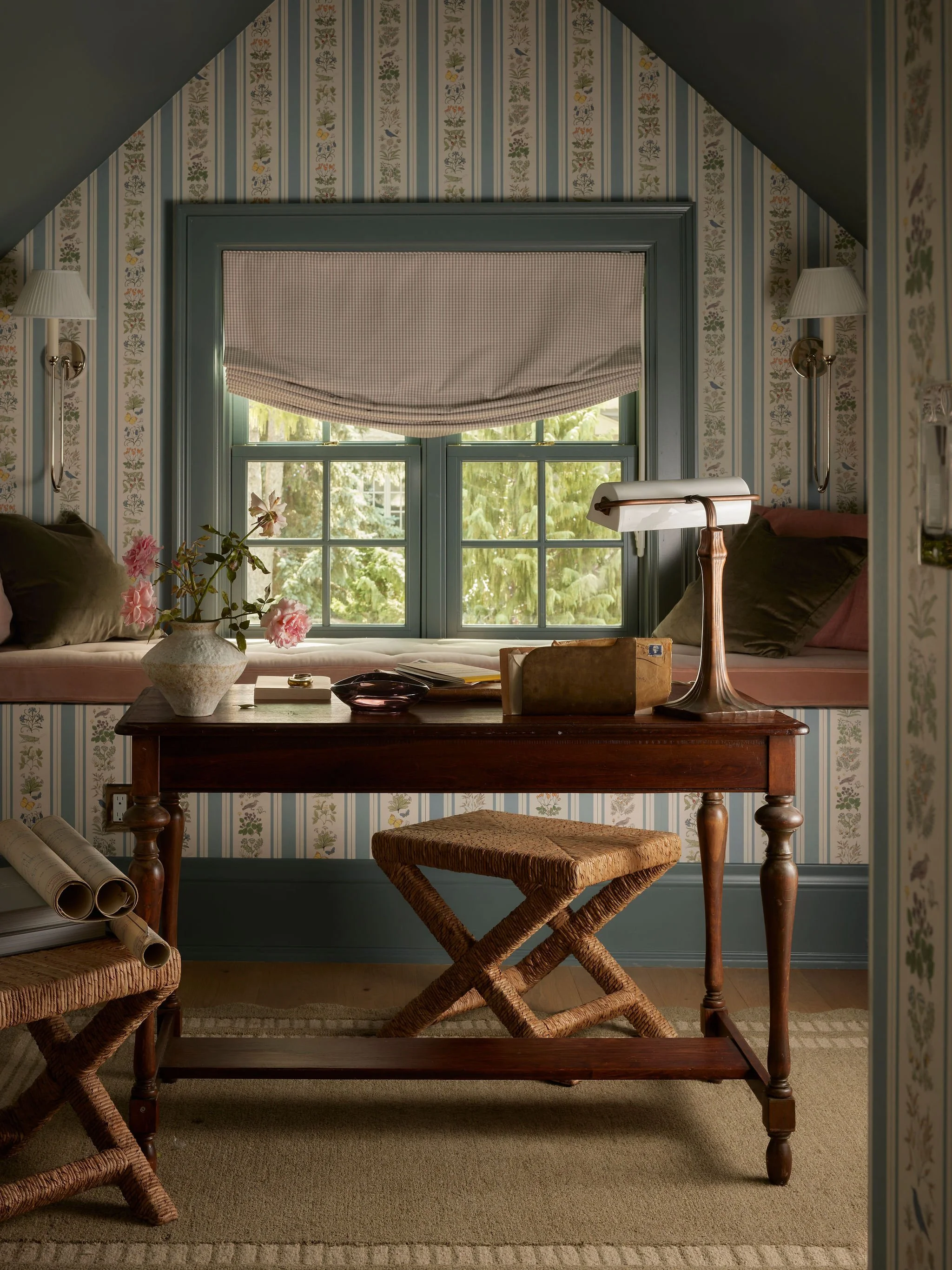
The home office was designed as a space for focus, creativity, and calm.
De Nimes is a beautifully balanced blue-green that changes with the light, adding richness without overwhelming the room. Its depth complements natural oak furniture, vintage pieces, and botanical wallpaper, resulting in a workspace that feels thoughtful, grounded, and effortlessly timeless.
Kitchen Millwork
Sherwin-Williams
Honed Soapstone & Accessible Beige
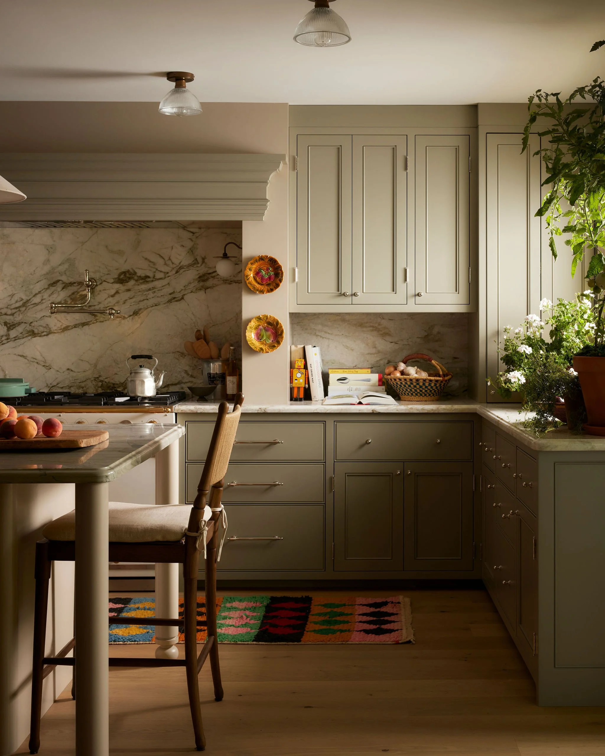
Rather than relying on a single cabinet colour, the kitchen uses a subtle two-tone palette to introduce depth and balance.
The lower cabinetry and island are painted in Honed Soapstone, an earthy olive green that grounds the space while complementing the natural stone and warm wood flooring.
The upper cabinetry is finished in Accessible Beige, a warm greige that keeps the kitchen feeling light and airy without the starkness of white. Together, the two colours create a layered composition that allows the stone, natural light, and carefully curated finishes to take centre stage.
The result is a kitchen that feels timeless, lived-in, and effortlessly welcoming.
A THOUGHTFUL APPROACH TO COLOUR
Throughout the renovation, paint was treated as more than just a decorative finish. Each colour was chosen to enhance the experience of the room—bringing warmth to everyday routines, creating moments of contrast, and adding personality in unexpected places.